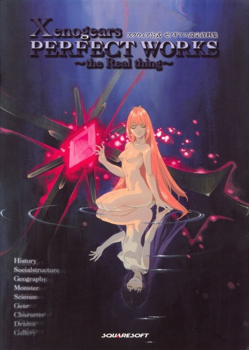
While I don’t ordinarily consider Plastic Pleasures a “news” blog, occasionally I get a little piece of info that is just too exciting to not spread all over the known internet. Bearing that in mind, when my twitter buddy Elliot Gay discovered that one of the greatest game artbooks of all time would be getting a re-print this year, I nearly flipped my lid.
It’s so rare I feel like I even have to handle this jpg with extreme care.
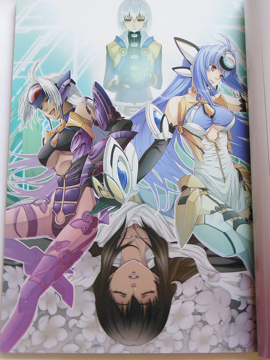
“Xenogears Perfect Works” by and large towers over the rest of my not-too-shabby collection of my most valued artbooks. It is not necessarily because this book is full of incredible art that it is so magnificent, but because it is basically the illustrated bible of my favorite video game of all time. It’s kind of like Hyrule Historia, except that it covers a single game rather than every game in an entire franchise. The attention to every single minute detail of this sometimes convoluted but always impressive JRPG story that resides in this book is a real wonder to behold for even the most hardcore Xenogears fanatic.
“But it’s all in Japanese!” you might say. I know, and I wish a company like UDON could localize this book more than anything, but the age of the game and the amount of non-existent scientific jargon it contains would likely make the localization of Perfect Works an enormous undertaking and a huge monetary risk. It’s not a total loss, however, because there’s a guy out there on the internet who woke up one day and said “Man, Xenogears Perfect Works is so awesome, I’m going to become fluent in Japanese just so I can read it and THEN I’m going to edit all 300+ pages of the book and release them for free.” His Flickr gallery of the entire book, in English, is right here. Up until this moment, I would not have linked you that and expected you to go buy the book itself, because it has been going for around $200 on eBay and through other secondhand means for years… but now that it’s getting a re-print, you’ll have no excuse not to pick one up!

Deus bless the man behind UltimateGraphics, who translated this entire book into English.
Ready to order a copy? Hop on over to the listing on Fukkan. If you’re outside of Japan, you’re going to need to use a deputy or proxy service to order this one, such as White Rabbit Express. The price is 5,250 yen — which is about 50 USD at the time of my writing.
UPDATE: You can now pre-order Perfect Works from Amazon JP, which eliminates the need for a proxy service!
If you’re like me and you can never get enough of Xenogears, here’s a few links to some great tributes that have cropped up within the past few years or so:
Project NOAH – The talented Diego Cabrera’s stunning effort to re-create Xenogears in 3D. You’ve gotta see it to believe it.
Xenogears 15th Anniversary Anthology – A free, digitally released collection of artwork from people all over the world. Started by rin-uzuki on dA.
Chromatic Gate – Xenoseries Full Color illustration anthology – A doujinshi released for the 10th anniversary of Xenosaga. Links to my review on this blog.
MYTH the Xenogears Orchestral Album – A CD released in 2011 to celebrate the 13th anniversary of Xenogears.
Humans + Gears – An impressive fan-made OC Remix album for Xenogears. Free download.
Tags: artbook, kunihiko tanaka, reprint, squaresoft, video games, xenogears